If your business is web‐connected, you’re probably aware that digital media’s “buzzwords du jour” are “responsive” and “adaptive web design”. And, if you’re like most people, you’re probably wondering what these terms mean, how they’re different, and why everybody is so keen on using them.
Preconditions for the matter at hand
Back in the old days, when the “worldwide web” was still learning to crawl, you could only design with HTML and every desktop pc had the same screen resolution: 640 × 480. What a difference 18 years makes. Today, we have CSS, HTML5, JavaScript tools and, according to Wikipedia at least 146 different resolutions for computers and handhelds.
Which brings us to our first two questions: what are the current trends for Internet access, and should you consider mobile traffic when working on the web?
Between 1990–2011, worldwide mobile phone subscriptions grew from 12.4M to 6B+. Today, 55% of mobile owners access the mobile web (Pew Research Center, 2012). Since it’s predicted that mobile internet usage will overtake desktop internet usage by 2014 (Microsoft Tag, 2012), you should definitely care about your mobile web presence and the response from your mobile‐enabled customers.
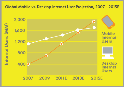
Illustration from Microsoft Tag
To be successful online, you should a) ensure that your website performs well at any resolution; b) maximize your site’s performance on different platforms, and c) design your site with the idea of mobile touchscreen controls in mind, since users like having the same web options and opportunities, regardless of the device they’re using. So whether it’s a 27″ iMac with lightning‐fast broadband, a WiFi‐enabled iPad, or a “tiny” smartphone display using 3G or the Edge Network, it doesn’t matter. Your web application must make the grade.
And this is where adaptive layout, responsive design and adaptive web design come into play as the most common and effective approaches to making your web application accessible to any user.
Adaptive layout as a response
Employing an adaptive layout is the most common way to personalize a user’s web experience, depending on their device. An adaptive layout is characterized by defined layouts for different resolutions with the help of Media Queries*. The technology these queries use allows the web page to use different CSS style rules based on the characteristics of the device the site is being displayed on. Using an adaptive layout requires defining several resolution values and creating a corresponding style sheet or style rules for each. The end‐result is that resizing the window does not change the layout. For each screen resolution type, a unique user interface is created that differs from the others in terms of functional/information block size and arrangement.
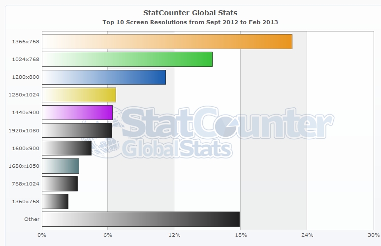
When creating an adaptive layout for your website, the first thing you should do is define a set of required supported resolutions according to your target audience’s needs. Also, you should consider the following statistics for the most popular screen resolutions worldwide:
Here’s a list of screen resolutions that could be supported by an adaptive layout:
- Regular cell phone — 240 × 320
- Smartphone (iPhone) — 640 × 960
- iPhone 5 — 640 × 1136
- Tablet (iPad) — 1024 × 768
- iPad 3, 4 — 2048 × 1536
- Common TFT (equivalent to iPad 1, 2) — 1024 × 768
- HD — 1366 × 768
- “Huge” screens (i.e. the iMac 27”) — 2560 × 1440
* Note: Since Media Queries is a CSS3 module, it is not supported in old browsers such as IE8 and lower. But don’t panic! Other scripts can be used (i.e. Respond.js) that make min-width and max-width work in IE6, 7, 8 and other browsers lacking support.
Nota bene: Be sure not to confuse “adaptive layout” with “adaptive design”, as they are two completely different things.
Responsive design as a response
Responsive design is an extension of adaptive layout, and includes fluid grids and flexible images, together with Media Queries. It also requires having defined layouts for different resolutions. Within each layout, the design is liquid and responds to the changing window size by resizing the relative elements’ width.
Responsive design was first suggested in 2010 by Ethan Marcotte, who defined it as having three technical ingredients:
- Fluid grids
- Flexible images
- Media Queries
Fluid grids are important for making a website look nice across multiple screens, but problems arise when they’re used with banner ads and videos, since these design elements are not fluid. When adding them, pay close attention to their actual size.
The term “responsive web design” itself can be confusing, since the design is not “responsive” to varying display sizes, browsers, etc. Rather, it “responds” via a fluid grid with flexible images, rather than by changing layouts. Nevertheless, the term came into being three years ago, and the aforementioned three ingredients became the term’s official meaning. When you get down to it, what we would intuitively call a “responsive web design” is actually an “adaptive web design”.
Adaptive design as a response
Adaptive design responds to different user conditions by adapting the website’s entire layout and functionality. Adaptive design is not just about screen size — it’s about accounting for the performance capabilities of every single device, a web browser of users, and rearranging the information. It means that you should consider things like browser window size, browser limitations, device performance, device functional potentialities (i.e. touchscreen and geo‐location support), etc.
Adaptive design’s main purpose is to ensure that visitors have a great experience, regardless of what device they’re using.
The technique of creating an adaptive design is often associated with the principles of progressive enhancement. Progressive enhancement implies that you start designing user experience “at the bottom rung” (i.e. an ordinary mobile phone browser), and then enhance the experience step-by-step: from classic browsers to modern JavaScript‐enabled browsers/touchscreen devices to 27″ iMac displays, browsers with the latest version of WebKit and lightning‐fast broadband. In other words, technology is applied in layers:
- Text layer — HTML
- Audio/Visual layer — HTML and CSS
- Interactive layer — HTML, CSS, JavaScript, Flash, and even Java applets
- Enhanced layer — everything under the WAI–ARIA (Web Accessibility Initiative — Accessible Rich Internet Applications) specification
Each of these layers creates different experiences, and each one should be treated with equal importance.
By following the progressive enhancement approach and applying modern technologies in an intelligent (layered) way, you can craft fault‐tolerance applications and deliver amazing user experiences.
Note: By contrast, an approach called “graceful degradation” (which was popular in the halcyon days of the semantic web) used an application’s premium version as the starting point for design and then built shiny, “fool’s gold” versions of it for those unfortunate users who had old browsers with JavaScript turned off. We believe this approach to be clearly inferior, thus we won’t say anything more about it.
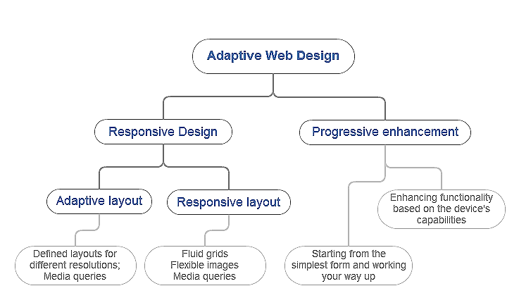
You could consider “adaptive design” as a combination of “responsive design” and “progressive enhancement”. HireRussians is a supporter of this theory, and the following illustration outlines our interpretation of it:
To make your web application “adapt” to a user’s capabilities (in terms of both form and function), start by asking yourself two questions:
- What key takeaway would I like users to gain from my website (information, pictures, video, audio, etc.)?,/li>
- Who is my target audience and what are their browsing habits?
If you understand your website’s value to your users, and by extension the content they want to access, you should design an experience that is available to and usable by anyone, regardless of location, device, or program capabilities.
Knowing your users’ browsing habits will help you define crucial technical requirements. Do your users use devices with touchscreen displays? If so, make your image carousel swipe‐able, in addition to featuring “previous” and “next” buttons. Can their device recognize their location? If so, add a “Use Current Location” button to your site, in addition to a store‐finder form. Does their browser support HTML5 canvas? If so, replace a static image with a canvas element. You can also organize content blocks depending on a user’s device, or even use different content sets for different devices. The customization possibilities are limited only by the amount of “user research” you possess, and the available technology.
In sum, adaptive design is characterized as having defined layouts and functionalities for different resolutions and devices. As such, resizing the window doesn’t change the layout.
Techniques you may consider when designing adaptive web applications:
- Media queries
- Fluid grids
- Flexible images
- Progressive enhancement
- Using different layouts and design elements, depending on the user’s device
- Adapted content blocks
For an even better understanding of adaptive design, HireRussians’ UI Designer created this adaptive design wireframe for a food web store (example only):
In real life
Having worked on hundreds of web projects for clients worldwide, we understand the reasons for not wanting to build responsive or adaptive websites. And though we believe that adapting your design is essential these days, we feel that we should mention the “cons” so that you can weight them against the “pros”:
-
Con #1: It’s expensive to design and develop several layouts to account for various functionalities.
In truth the cost increase is negligible, and very reasonable considering the return. Also, an adaptive or responsive approach is even more affordable if you decide to develop native apps for several mobile platforms.
To be honest, there are some cases when implementing adaptive or responsive design could be a monumental task, and thus become expensive, i.e. when retrofitting a large corporation’s existing web system with unique navigation, custom CMS and i-framed content all at once. But even in such difficult cases, a compromise can still be found; one which still keeps the user top-of-mind and delivers a quality experience. Later in this article, we’ll take a closer look at an example of a “compromise approach” to adapting an existing website.
-
Con #2: My web content is not easy to adapt.
This is a very common lament, especially from existing website owners, and it stems from their belief that much of their content was created some time ago, and not always accurately implemented. But what is “web content”, really? The answer, of course, is it’s your website’s texts, images, videos, audios and forms, all of which can be styled with CSS. Therefore, you just need to give some thought to how you’d like your content to respond.
-
Con #3: There isn’t enough support on common browsers.
True, there are some support issues with media queries in old browsers like Internet Explorer 7. But as we mentioned above, there are valid workarounds, like Respond.js.
-
Con #4: My website looks ok on a mobile browser.
Thanks to Apple’s Safari, almost any website works just fine on a mobile device. But think about the last time you had to use “zoom” on a site just to be able to read its text on your iPhone. Wouldn’t it be much easier to browse an adapted 640‐pixel‐wide webpage? Also, you’ve surely seen websites that are hard to navigate due to dodgy touch control. With adaptive design, all of these issues can be accounted for and improved upon.
-
Con #5: I already have a mobile app for my website.
Awesome! But have you seen the research performed by the Pew Research Center, which shows that 60% of tablet users prefer reading news on the mobile web rather than via an app, while only 23% get their news mostly through apps — with 16% using both equally?
-
Con #6: It’s difficult to maintain an adapted website.
In some situations, it conceivably could take a little more time to make web changes; for example, when adding a new illustration you must make sure it has a consistent, high-quality look on different screen resolutions. However, in our experience we’ve never encountered an impossible maintenance task. Updating an adapted or responsive website simply requires the web owner to test it appropriately.
What approach should I choose for my web project?
There’s no doubt that starting a new web project with a progressive enhancement mindset coupled with adaptive design is a great way to go. With such an approach, you can finally design around user experience, and not just pictures and CSS.
But what to do about existing sites which were designed and developed in the days of yesteryear, before all of these modern technologies appeared and which already have an audience and users? What’s the best way to adapt these?
In a perfect world where time and money are immaterial, you would have several options for making an existing website friendlier for millions of devices and screens:
- Building native apps is an obvious solution, since having apps for the major mobile platforms is better than having no apps at all. However, you won’t be able to build for every app store; also, bear in mind the Pew Research Center info about users preferring to read the Internet via the mobile web rather than via an app. Additionally, stand-alone apps will increase the amount of updating and maintenance required. Taking all of this into account, we don’t believe that native apps are a universal panacea for adaptation, but they are one of many ways to better engage users.
- You could develop a separate mobile version of your site. However, this would result in additional maintenance and a large amount of development work. Also, do you know if your users would respond positively to a modified mobile version of your site? Before investing in mobile version development, get to know your users’ behavior and expectations.
- Lastly, you could “throw out” your old site and design a new, adaptive site from the ground-up. This is a great option, though it would take a veritable Jedi to balance your daily work tasks with development of a new system. In this case, instead of waiting for Obi‐Wan Kenobi to appear, it would be great to have a development team you could turn to so you can focus on what’s most important — growing your business.
It’s very rare that an existing business has the luxury of creating a brand-new web presence that includes every device-agnostic technique, along with native apps for different platforms. That’s why there’s always a compromise when dealing with existing websites. Often the following approach is the way to go: maintaining the code and content that’s been powering the site, while adapting the site using media queries and “fluiding” the site — that is, making it as vertical as possible to provide for handy access from phones and other items with tiny screens. This path allows HireRussians to update a client’s content all in one place, while maintaining just one code and database. And of course, it also cuts down on development expenses.
The key point is that making your site adaptive is not always time and money‐consuming; you just need to pick the right approach for your specific needs, and proceed in a holistic manner since time and money aren’t limitless. Keep moving and don’t stop improving! That’s this article’s theme.
The Bottom Line
Thanks to our vast web development experience, we understand the need to raise awareness amongst our customers and ensure that their sites are as adaptive as possible. We believe that mobile traffic’s rapid growth will trigger a wave of website redesigning/updating, simply because the concept of adaptability is becoming a must-have for every web business.
