By Sibers UI Designer Irina Odnoval
Accompanied by Sibers Design Teamleader Eugene Odnoval
Sure, you have probably heard the jokes (or depending on the attitude, horror stories) like this one about working with graphic designers. If you have been in this predicament, you most likely do not find the joke very funny at all. We understand your feelings: you told them exactly what you wanted, yet still your final product does not look professional, appealing or for that matter, even nice. Sometimes, creative people are not that easy to deal with, and of course, there is always the possibility that you could have fallen victim to an incompetent and unskilled novice. The most common problem however, is that there may have been things you should have more effectively communicated when ordering a design for your cutting-edge website or save-the-world app, but you did not do so properly because it never occurred to you they would be things the graphic designer would need to know.
So, what exactly should you have stated?
To help you avoid future problems, we have jotted down five tips for communicating your wishes to graphic designers; the importance of which is often underestimated.
What is Your Idea?
This is actually what you should begin with. There should be a clear and concise business idea behind each design. What do we want to design? Who is our target audience? What goals would we like to accomplish? What problems should we solve? You might just be surprised by how much information is vital for the success of your design project aside from just colors, styles, and fonts. You will still need to stipulate that you would like vivid colors, web 2.0 buttons, or your site to essentially look and feel like www.apple.com (boy, do we get that a lot!), but you will also need to be prepared to dwell upon your business goals before you get down to choosing color palette.

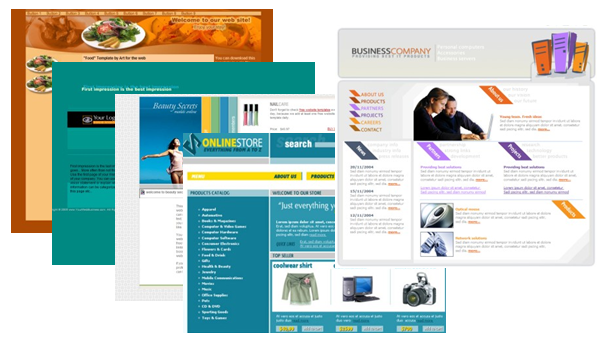
Customer: I want my site to look a little bit like this site and a little bit like that one. And copy the left menu form this site. Designer: Please tell me first what your site is about.
As Dan Rubin (no doubt, a really smart designer) says: “There’s a common misunderstanding of what design is exactly. Design is not just the visuals and the aesthetic aspect of making something look pretty or attractive. […]Design in its core is about the visual aspects that support the functionality in a given thing. If we’re talking about physical products in the real world or virtual products such as web apps and services, the design is what communicates the functionality to the user”. It’s really hard to put it more explicitly than that.
What do you have So Far?
The next important thing to mention is whether or not you have some designs completed for your project so far. You must understand that if you need a design done from scratch, your new designer has vast room for creativity, but this also makes his job a bit more difficult because he needs to come up with the whole new concept.
Another case would be if you need your new design to be in accordance with an existing corporate style. If you would like to have a company website, for example, and you already have a company logo, this is a great start! That being said, you must make sure you show the logo to the designer before he sits down with his graphics tablet. This somewhat limits the designer’s imagination, but is also good, because he won’t get carried away in the wrong direction, and you will wind up with a nice conceptual design for your entire product.
Just recently one of our customers ordered a design for his site and he already had a logo with a white-blue, kind of Old Testament dove on it. Now he was smart to tell us about this beforehand. Imagine him saying as our designer hands in his work: “Oh, and could you integrate my dove logo… into this high-tech grey-and-red design…” That would have been fun!
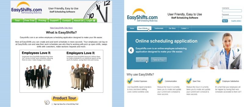
You may also want to address redesign. If you already have a design for your product, but you are not particularly fond of it any more, make sure you communicate what exactly is wrong with the old version and what you want to avoid in future. This will prevent both you and your designer from having to do double work.
What would you like the User Experience to be?
To create a masterpiece, a painter has to think of its future composition. We know for sure that even Michelangelo did a little sketching, so why shouldn’t we? To create a functional design (that “communicates functionality to user”, remember?) the designer must know where the banners will go and if there should be several levels of menu on the site. This kind of sketching for web and software designers is called User Interface or User Experience design.
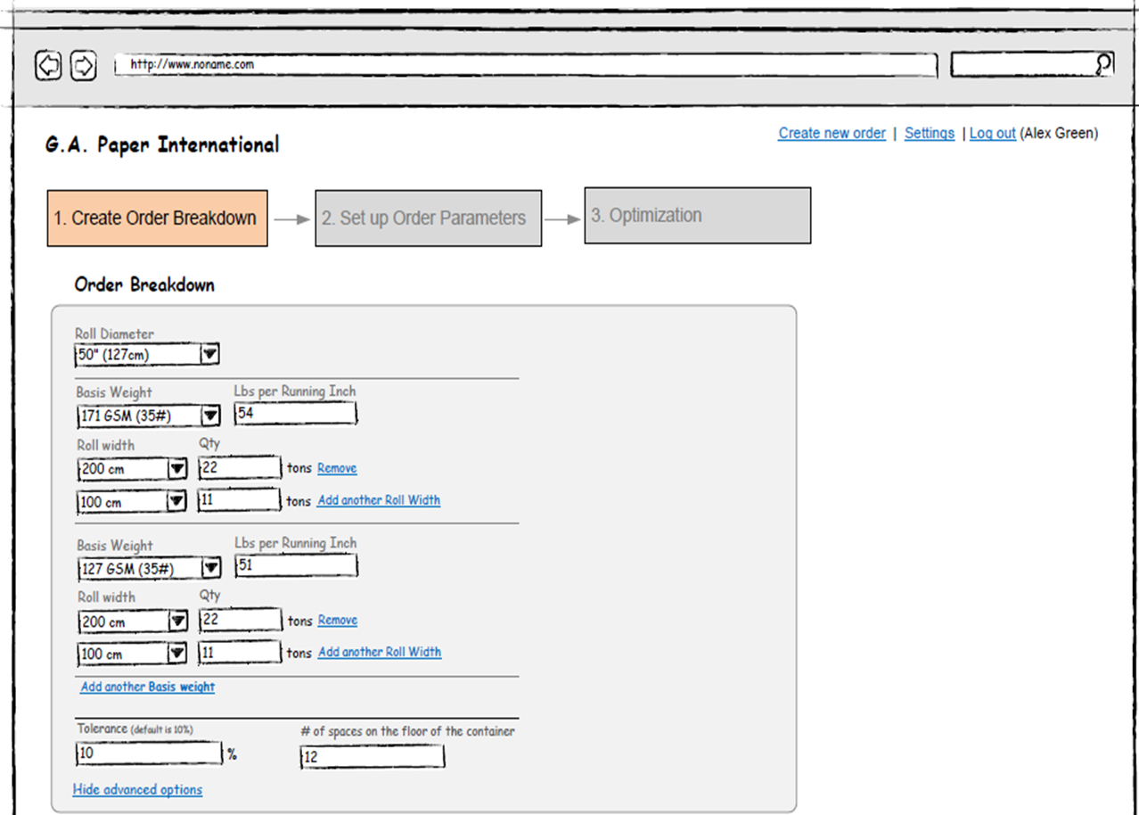
If you know what results you want to achieve with the product, but aren’t sure how to organize the information properly, we strongly advise to allocate this to a UI designer first. The result of this stage is a set of wireframes – schematic drawings of the future site that show the basic elements layout.
If you have a clear idea of what you need to see and where you would like to see it, don’t be shy and share this. Even an old-school hand drawing is better than nothing at all.
What Type of Content do you need?
If you have dealt with designers before, chances are you have seen the Lorem-ipsum-expelliarmus-blah-blah-blah spell they often put as a dummy for article texts in sites’ designs. They basically have to do it to improve the future site visualization, because the content is either not ready yet or they do not suspect it is. Usually, the site content is often left for dessert in the site creation feast. However, the designer must have at least a vague idea of what content will go onto which page. So, what exactly does this have to do with the designer’s work? It could happen that your joint efforts produce a stunning design, but when you start putting the content in, you might discover that the style is not suitable for the amount of information you are inputting or the photos you are uploading do not go well with the general concept. Ouch…
What Level of Complexity Should the Site Possess?
There is probably no need to mention that the complexity of design requirements directly influences the amount of work that must be done by the designer. Even people who have only a vague idea about the designer’s work would agree that coming up with a simple and neat icon is quite different from creating an elaborate 3D animation. The first case scenario may take just 1-2 hours, the second one – much longer. So don’t forget to mention the complexity of graphics you expect to see so that your designer is able to give you realistic estimations and complete the work on time.
Conclusion
The above mentioned criteria are the things that are vital to cover when ordering GUI design. If we were to sum it all up with just one good piece of advice on how to avoid confusion during the design stage of the project, we would say: “Communicate with your designer”. Verbalize every expectation you have from the beginning to the final product. Be ready to answer a plethora of questions at each and every stage of work. We assure you, there is no irrelevant information you could possibly give, whether you talk of the color shades that appeal to you the most or your business organization – all of this extra effort will show through in your dream design.
Stay tuned: next time we’ll discuss in more detail what UI design is, and why do you need it. We’ll also take a closer look at different types of GUI tasks and see how the design turns into a real app or a complete website.


Hello There. I found your blog using msn. This is a very well written article.
I’ll be sure to bookmark it and return to read more of your useful info. Thanks for the post. I will definitely comeback.